joe is a coffee ordering app for indie coffee shops.
I worked on enhancing the visual design, UX, and UI design on both the B2C mobile app, and the B2B tablet.
-Detailed work process can be presented during interviews-
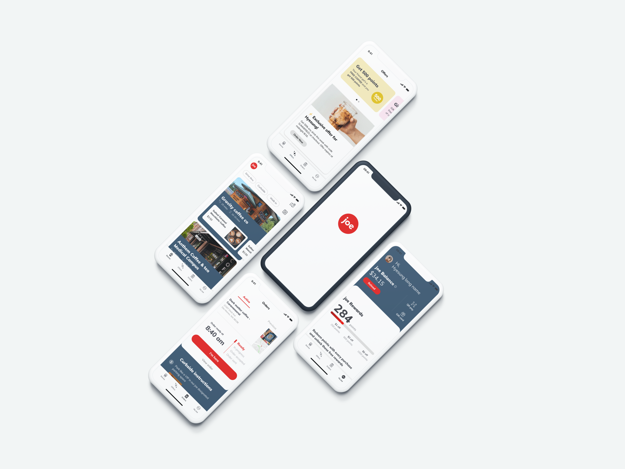
Storelist
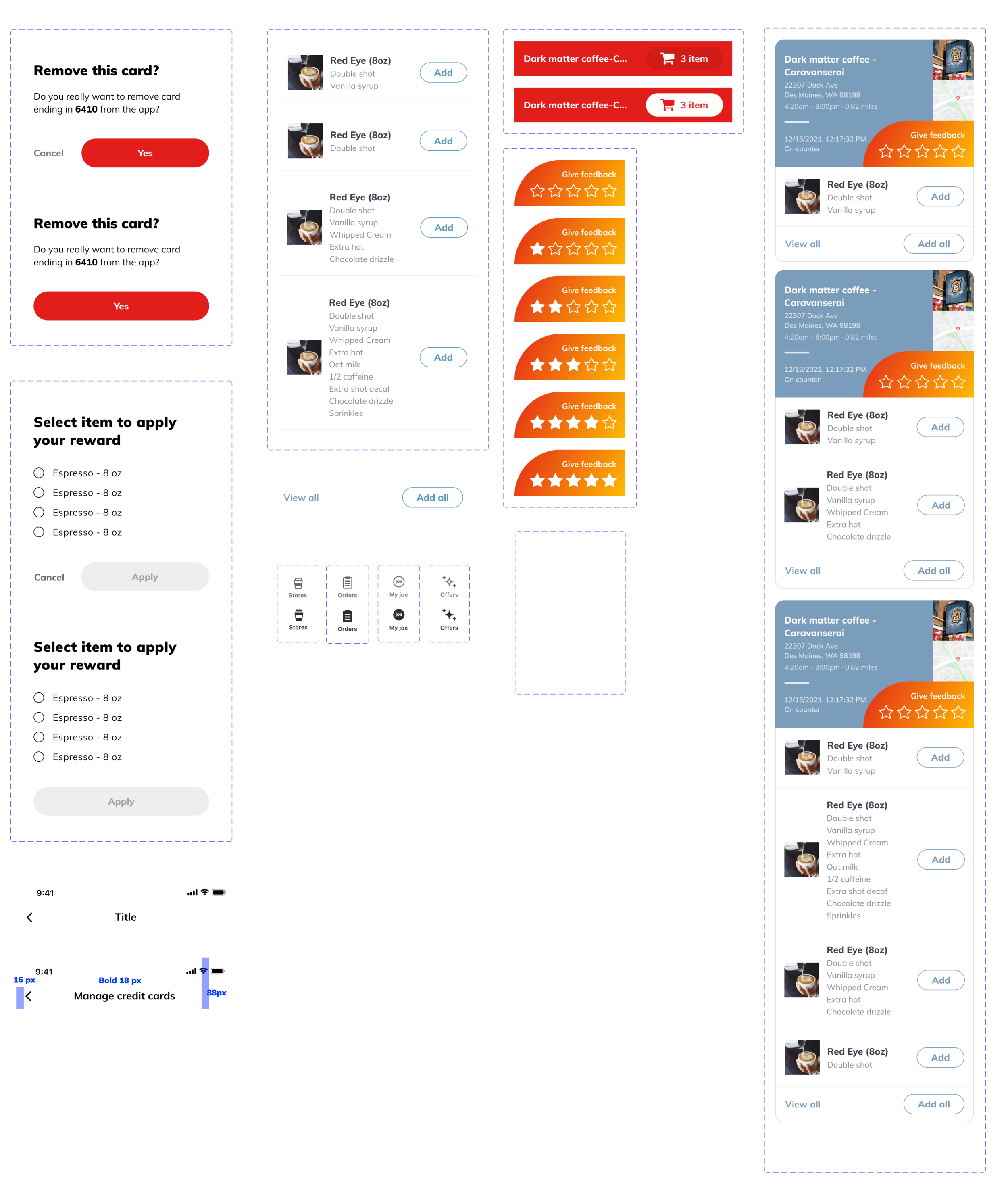
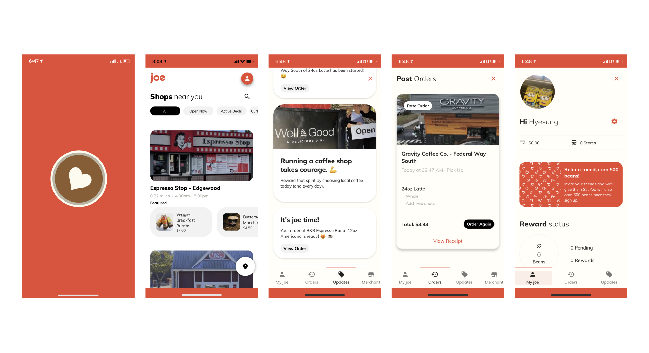
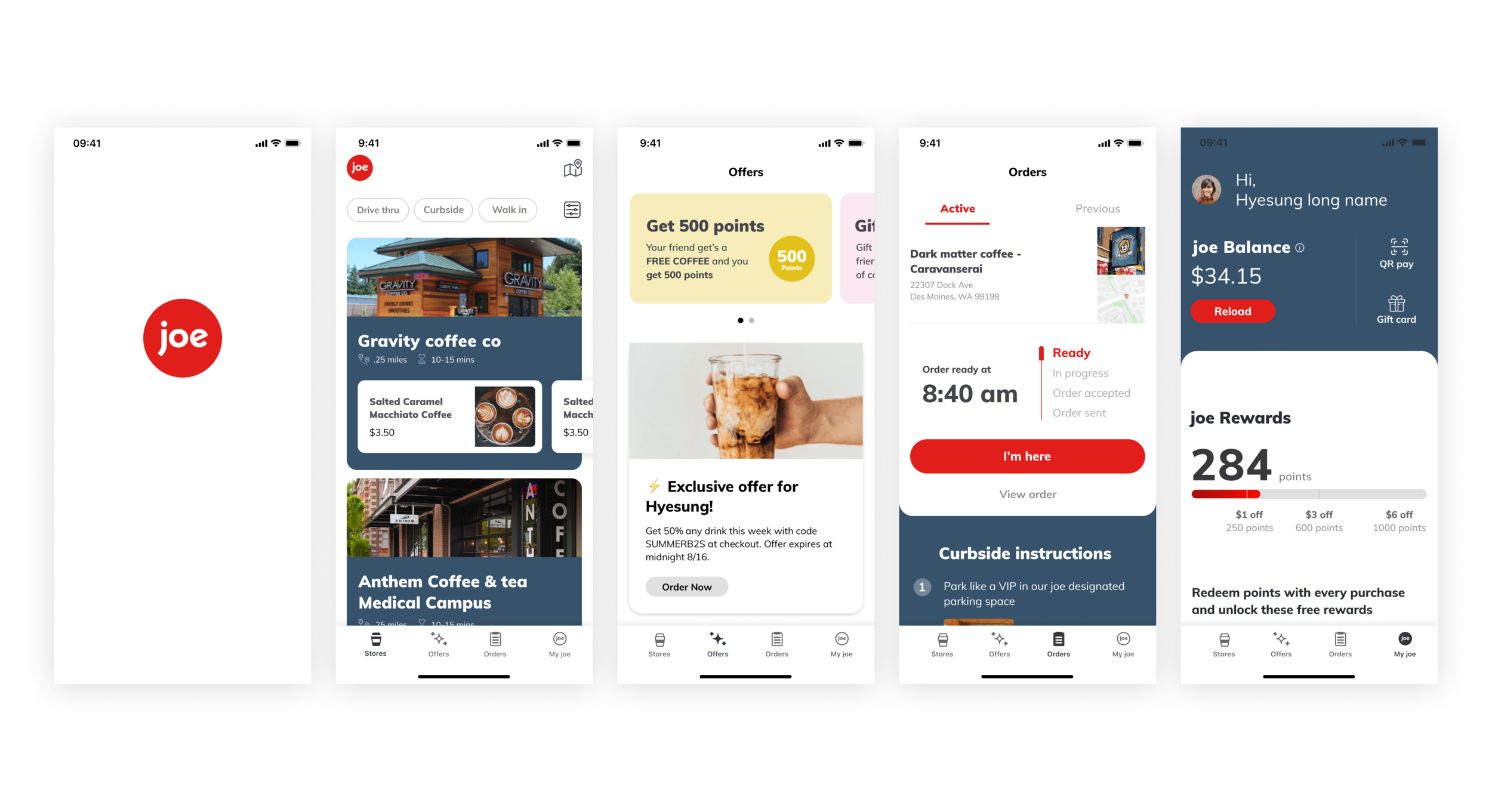
I redesigned the store list page. The existing screen was extermely messy and so the challenge for me was to clean up the UI yet include all the information needed while having multiple parts that seemed to scream for attention. I designed the screen so the store name and the featured items were the most visible.
Order status
Order status project was to improve the experience after users place their order. We wanted to streamline the experience until they receive their order.
Order feedback
We wanted to get more feedback from the customers. The challenge was to make sure to get feedback once they receive their orders. In the existing design, the feedback was being received even before they place their orders, and was also not visible enough for the customers to give more feedback.
My joe + Rewards
My joe screen was where users can view their points and rewards, and also their joe balance to make purchases on orders. It was a challenge to include so much information, yet different information in an organized manner. I also added a refer a friend banner for an opportunity for users to refer their friends. The settings view on the bottom was also redone in a more organized manner.
Merchant POS tablet
The existing POS design was creating a more complicated workflow for coffee shop owners, and needed a redesign so they can better manage incoming orders. A wait time control was also newly added so store owners can adjust and communicate their wait time to their customers to inform users of the potential wait time for their order being ready.
Customer facing POS tablet
The customer facing tablet needed a redesign for a better experience
Visual design
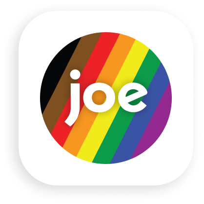
App icon design
Main iOS app icon

Pride icon idea
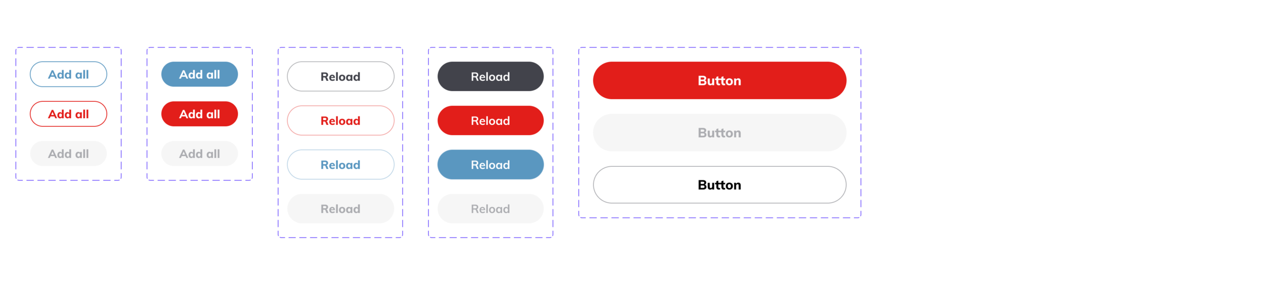
Design system components
In order to keep the designs consistent, I started a very basic form of design systems in components and variants, and also introduced the new blue shade to balance out the red primary color.